Category: EDCI337-blog

Assignment 4: Multimedia Project

Retrieved from ApplyBoard

A Guide to Student Budgeting

Group Members: Michelle Mylrea, Sydney Barr, Sehee Park, & Justine Cook

Introduction to Lesson Plan

This lesson is designed to educate students on conscious spending with a limited budget. It is divided into 3 topics: spending on food, spending on educational tools and resources, and spending on lifestyle, and it is taught by using various forms of multimedia. The lesson also includes information about how 4 current university students are spending their money. To help support and encourage active learning, the students are asked to create their own budget at the end of the lesson.

Learning Objectives 

In this lesson the audience will:

  • Gain insight into spending habits as a university student
  • Identify and reflect on the main purchase habits that are the most expensive. 
  • Show student budgeting concepts and applications and practice how to reduce spending. 
  • Create an optimal budget based on their personal values, needs, and wants.

Food

Food is an essential part of student budgeting. Students need to consider how fast their money can go when they are eating out or ordering food for their homes. Balance is always crucial when spending on food, but there are tricks to help students with tight budgets spend a little less. The screencast details four tips on how to save money on food better along with creating good decision-making habits when grocery shopping. 

Watch Screencast

Screencast created by Sydney

Education

Students face many expenses regarding their education; including tuition, student fees, textbooks, and supplies. While there are some educational expenses that are unavoidable, students are able to make alternative decisions on certain purchases as a way to save some money. Textbooks are often a required resource for university courses, however, they can come to be very expensive. According to Mark Brown’s article, What Canadian University Students can Expect to Pay for Books (2017), the average amount spent by students at the University of Victoria comes to $780.94 per school year. The infographic below outlines five alternative ways of acquiring textbooks to encourage students to be smart with their money. 

Infographic created by Michelle

Infographic Audio File:

https://drive.google.com/file/d/1SMv2rqAvRtukYl7towyWYFGtAjbiAcwh/view?usp=drivesdk

Other/Lifestyle

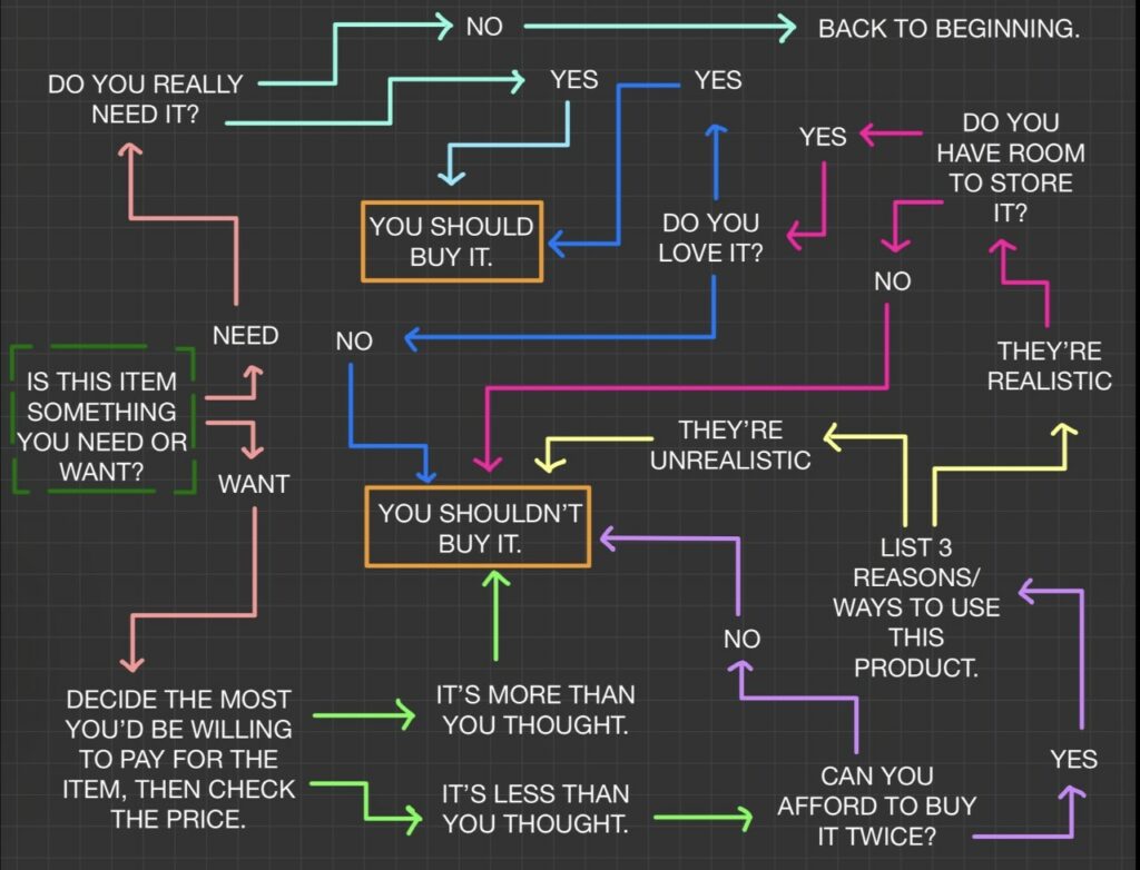
Students can choose to spend their money on a variety of products and services, and this all depends on their individual values. Below is a mind map outlining examples of lifestyle purchases a person can make, and there is a sketchnote outlining a recommended process to decide whether or not an item is worth the purchase. A strong indicator of whether or not to make these purchases is to decide if the product or service is considered a “need” or a “want”. Begin the sketchnote at the first question on the far left.
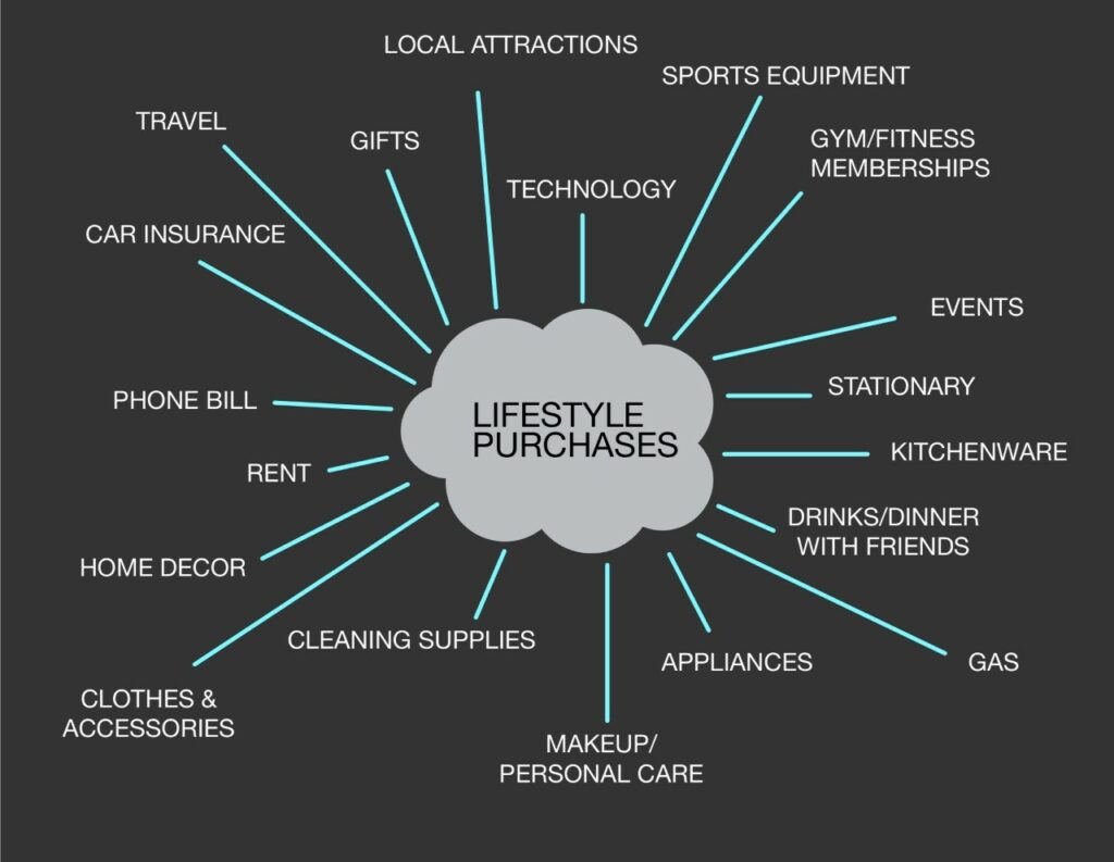
Mind Map created by Justine
Sketchnote created by Justine

Student Opinions

In our podcast, we discussed the challenges, highlights and importance of student budgeting. The varying opinions we heard depict the similarities and differences in how we spend our money as students. It is important to recognize that every student has a different approach to spending and saving and some people may be better in one area, but require improvements in another. Click the picture below to listen.

Podcast created by Sehee
Retrieved from Canva

See transcription here:

To Do This Week 

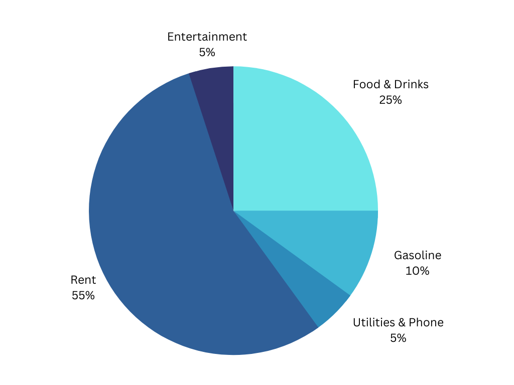
This assignment is for the purpose of getting familiar with budgeting and tracking your spending. You will be creating a pie chart based on your personal monthly spending along with answering six short questions to which you will be reflecting on your personal budgeting strengths and weaknesses. 

See below for an example:
Reflection

Graphic Design

Graphic design is important for comprehension because it helps students to stay engaged with the topics at hand. Creating a piece of multimedia that is visually appealing is important for retention. We incorporated graphic design tools into our infographic, sketchnote, and screencast video. Both learning objects include tools such as colour, proximity, balance and contrast to improve the learning experience by keeping the design visually appealing and easy to follow.

Storytelling

Storytelling in multimedia is essential when trying to create relatable and engaging content. As it allows students to use their imagination and experience. It also helps to make the content more personal as individual experiences show a lot of depth. In the sketchnote, a story is created for the reader as they decide whether to buy the item or not. A narrative is created for the object that the person wishes to buy. Personal stories are also shared in both the podcast and the screencast – as this helps the narrative feel comfortable, engaging, and relatable.

Dual Coding Theory

Allan Paivio’s Dual Coding Theory highlights the difficulty of only having one form of delivering information. One being language and the other being image. Having both verbal and visual stimuli makes it easier to remember and process information. This theory supports a way of learning that many individuals prefer, which is used in a screen-casting format. 

Cognitive Load

We have tried to reduce cognitive load by limiting the word count in each of the section introductions. Cognitive load theory has concluded that “Working memory capacity can be effectively increased, and learning improved, by using a dual-mode presentation” (Sweller, Ayres & Kalyuga, 2011). By creating media that includes dual coding theory, cognitive load is reduced.

Multimedia Design for Learning

It is essential to incorporate multimedia design into WordPress blogs because too much wording with too few breaks can be very overwhelming. Combining various types of media helps to make the content easier to digest and overall more engaging and interactive. This lesson plan accommodates both verbal and visual preferences for learning and includes opportunities for practicing budgeting too.

Accessibility

Recognizing different forms of diversity and learning needs is important for creating a better learning environment for everyone. The goal for future education should be to remove barriers that prevent people from accessing education. We followed the practical design choices such as using simple text, adding captions, creating audio files, and using visuals to explain concepts. 

References 

Brown, M. (2017, December 4). What Canadian university students can expect to pay for books.

Macleans.ca. Retrieved December 1, 2022, from

Sweller, J., Ayres, P., Kalyuga, S. (2011). The Goal-Free Effect. In: Cognitive Load Theory. Explorations in the Learning Sciences, Instructional Systems and Performance Technologies, vol 1. Springer, New York, NY. https://doi-org.ezproxy.library.uvic.ca/10.1007/978-1-4419-8126-4_7

Week 12 Blog Post

retrieved from Terezast.com

Have you used a tool like Khan Academy that creates a learning path for you? Did you find it to be useful or a hindrance to your learning?

I first started watching Khan Academy videos when I was in the seventh grade. Math was never my strong suit and I often needed help from others to explain certain concepts and solve problems. Usually, my mom or my brother would sit down with me and go over any problems I needed help with, however, it would often result in further frustrations. My mom eventually introduced Khan Academy to me, and I started watching the math problem-solving videos on a regular basis.

I found the Khan Academy videos to be extremely helpful, as the narrator, Salman Khan, was really good at explaining the exact steps to solving mathematical problems. These videos were certainly useful for my learning due to them being in a video format so that I could pause and rewind any time I needed to, along with Salman’s ability to break down certain concepts into simpler terms. I also liked how the website was set up, as the different grade curriculums were grouped together, making it easy to follow along with the videos as the following demonstrations would correspond to the next concept to be learned in my class’s material.

While the Khan Academy videos were helpful for the most part, I would sometimes find that certain explanations were not the same as what my teacher had been showing, which in some cases would hinder my learning and result in me feeling more confused.

Overall, I believe that Khan Academy is a great tool as a secondary resource for learning due to my personal experience, however, it is not a tool that I would strictly rely on for support.

Assignment 3: Core Multimedia Skills

Retrieved from beautiful.ai

Embedding interactive multimedia and design principles while creating a lesson is key to providing an effective approach to learning. As we have made it this far in the course, I feel as though I have learned a lot about the proper ways to create strong multimedia tools that can enhance the understanding of content for a learner. Reflecting through previous assignments that I have done for other courses, I have noticed that I have made multiple mistakes that could be adjusted to improve the effectiveness of presenting the content. The multimedia object that I have chosen to upgrade is a short lecture video that I created in EDCI 339 for a mini course assignment that I did about skincare. The lecture video was accompanied with a powerpoint presentation, which now looking back on it, I see that it could be harmful to a learner, as the design of the slides may increase the extraneous load.

Video Lecture (original)

As you can see in the video, the slides have way too much content on them and can make it hard to focus on any single point being made. The overall video violates the redundancy principle and signalling principle due to the poor design of the slides. The elements that I focussed on when creating the updated version of the lecture video include, reducing the cognitive load, implementing the signalling and coherence principle, and keeping one idea per slide.

Upgraded Video Lecture

In the upgraded video lecture, I believe that I was able to effectively present the lesson in a much clearer and more suitable way. Incorporating the design principles that I have learned in this class, along with the tips given in David JP Phillips’ TedTalk, How to Avoid Death By PowerPoint, I was able to design the slides in a manner that could improve the learning for a student. By keeping one idea per slide and reducing the amount of text on a slide, I am able to  reduce the cognitive load and make it easier for a learner to pay attention to the narration. This is an example of the redundancy principle. I also wanted to incorporate the signalling principle, so I decided to show the points on a slide one at a time, as to hold the focus on only one element with the narration. This reduces the cognitive load by giving learners a clear path to follow along while they are watching the lesson and to not be overwhelmed by there being too much information given all at once. I also added subtitles manually to make the lesson more inclusive by including proper grammar that matched with the narration perfectly. One of the elements that I kept the same was the background colour, as it is dark and provides a good contrast to viewers, especially those who may have impaired colour vision.

Week 7 Blog Post

What storytelling techniques have you used instinctively and which ones require more work for you? Which techniques will you focus on moving forward?

I find that my personal strength in storytelling is my ability to engage audiences with a suspenseful plot. When I am telling a story to a friend, for example, I notice that I’ll instinctively begin directly from the start of the story, then I will discuss the events that lead to the climax. Following a well-structured and chronologically ordered story, makes people more engaged as they know the events that lead to the main point of the story. The events before the climax are ultimately the key to engaging the audience, as it gives them further insight into the storyteller/protagonist’s life and allows them to empathize with whoever’s story is being told.

While creating suspense in a story is what I would consider a strength for myself, I do however find that I share too much information when building up the plot. When I am telling my friends a story, I tend to dive too much into the details of a specific point or event in order to try and give them as much background knowledge as I can. While this can be good for adding to the suspense of a story, it can sometimes come across as me rambling. My friends have often told me to “get to the point”, due to me going on and on about a specific detail. Moving forward I want to try and tell stories in a way that can keep the leading events of the plot more concise and structured to effectively present a story that doesn’t stray too much from the plot.

Week 6 Blog Post

Where do you see constructive alignment and backward design used in this course or another course you are taking/have taken?

Incorporating instructional design into course planning is key to keeping students engaged and on the right track. Setting learning outcomes early in the course can guide students to be prepared for what they will learn and give them insight into what is expected of them.

In most of my courses, the professors are generally very good at identifying the learning outcomes for the course or lesson early on, which helps me get an understanding of what is to come and how I approach the course or lesson at hand. I will often see this in the syllabus of the course or more commonly, in each lecture where the ‘learning goals’ are outlined for a specific lesson.

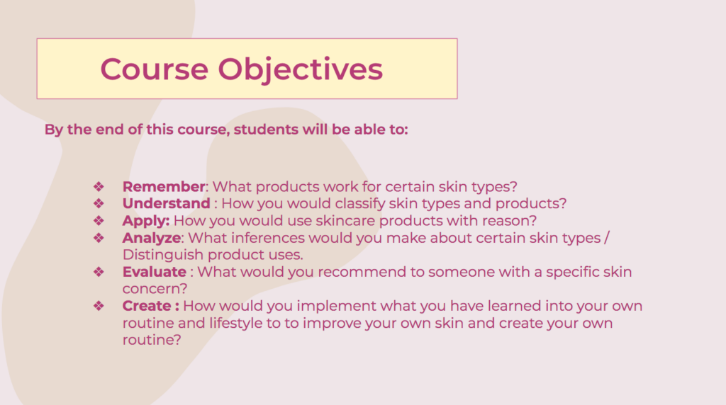
This week’s lesson reminded me of an assignment I did in my EDCi 339 class over the summer. I got to design and create a mini-course about any topic, where I would be designing the course layout and making my own lecture videos. One of the most essential parts of creating this mini-course was setting the learning outcomes early on to guide how we design the course and what we want to incorporate so that these learning outcomes are met. Here is a photo of the learning outcomes I made for my skincare 101 course:

Skincare 101 mini-course “Course Objectives”

Having these course objectives pre-established made creating the mini-course much easier for me, as I was able to use them as a guide to narrow down what information I needed to include and how I was going to assess the ‘students’. This mini-course assignment overall was really fun and definitely gave me insight into how instructors design courses.

Now having learned about Constructive Alignment and Backward Design, it was really interesting to look back at my mini-course and see how I incorporated them into it without knowing about these design principles. Instructional design is key to creating a strong framework for a course or lesson that benefits both students and instructors.

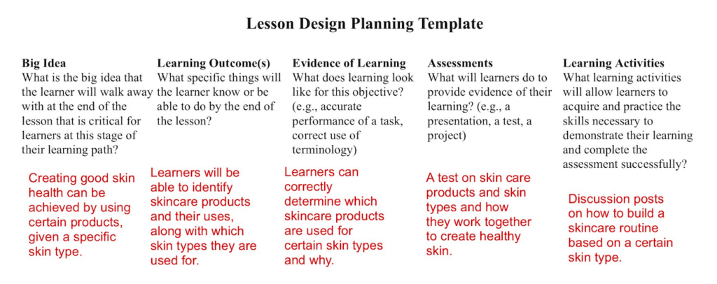
Here is the lesson plan I made that is based on my skincare course

Also, if you are interested, here is a link to my mini-course that I created with google slides:

Mini-Course: Skincare 101

Week 5 Blog Post

What do you think the presentations in The World’s Worst Powerpoint Presentations have in common? Which design principles and which other principles (Mayer’s, Inclusive Design, UDL) are they missing?

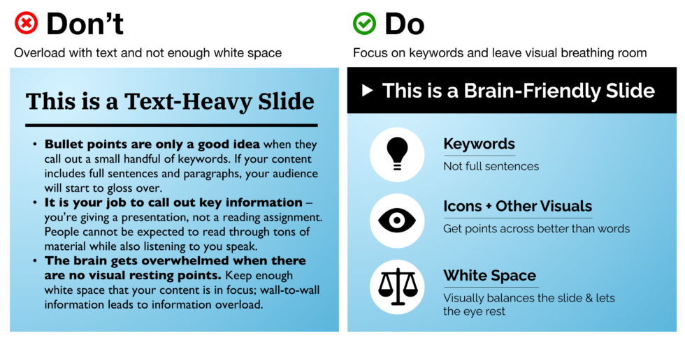
The presentations in The World’s Worst Powerpoint Presentations were all very similar in that they do not follow the principles of Mayer’s Cognitive Load Theory. When I first looked at the Powerpoint slides that were shown in the article, my first thought was how the extraneous load was being maximized. At first glance, these presentations were very hard to read as they all seemed to have way too much on the slides and could not draw my eye to any certain point. Negative space is so important for keeping presentation slides coherent because it helps reduce the extraneous load, which aids the audience in not becoming overwhelmed.

Comparing a slide with no negative space and one with negative space. The slide with negative space is much easier to look at and comprehend the text.

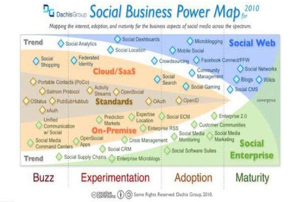
One of the slides that were shown in the article had a very confusing diagram that lacked any visual coherence. This was partly due to the amount of text that was on the slide, however, the most significant contender to why this particular slide failed was the amount of colour and how it was used. The slide used about 10 colours, which paid no benefit in assisting the viewer to understand the given information and created no balance on the slide. Optimizing colour to support your design and the idea that you want to present can be very important and will help guide audiences to understand and break down ideas. This design principle helps to manage the intrinsic load in presentations, as it could help to segment ideas together.

Here is the slide I am referring to in The World’s Worst Powerpoint Presentations

I thought that this week’s topic was really interesting and fun. The design principle that I thought was one of the most important to note was the negative space principle. I think that using negative space in any design can prove to be very effective in ‘calming’ the eye and drawing it to focus on only one or more points, which results in reducing the extraneous load and managing the intrinsic load.

Week 4 Blogpost

Have you used Text to Speech tools before? Did you find it useful? Did you try out some of the different voices? What impact did the different voices have on your ability to absorb information?

I tested out a few of the Text to Speech web extension tools listed including, Read Aloud and Natural Reader. I found them both to be useful, however, I preferred Natural Reader much more because I found it easier to navigate and personalize to my audio preferences, such as the voice and speed. I noticed major differences between the voice on Read Aloud and the voice I selected on Natural Reader. The voice I selected was “Sara”, which was a woman’s voice that seemed to be the most natural human voice and it did not sound very robotic compared to the other options. I also really liked that I could set my own speed for the reading, as it could flow at the same pace that I would normally read. I had actually found that this tool was quite helpful when I was testing it on the EDCI 337 website. I really liked how it would highlight the section it was reading off in small chunks as it made me pay more attention and kept me engaged. One thing that I did notice that may not be very helpful to someone who is visually impaired, is that it did not state aloud if there was a photo, but would just read the text below it. If the text below the image did not have any mention of there being a photo, such as, “This is an image of”, it would likely cause some confusion to someone with visual impairment. I thought this was interesting because in Katie Sehl’s article, Inclusive Design for Social Media: Tips for Creating Accessible Channels, it was mentioned to skip saying “image of”, as those who are visually impaired prefer to not have that. This made me more curious about the multimedia preferences of visually impaired people and I am keen to learn more about it.

This image demonstrates the difference between equality and equity. On the left side, there are three people trying to pick apples off a tree but they are all different heights and only 1 person can reach the apples, which illustrates equality. On the right side, showing equity, there are the same three people, but those who were not able to reach the tree now have something to step on to make them able to grab the apples.

I thought this week’s content was really interesting and gave me further insight into how to properly accommodate the learning needs of many people. Having a multimedia framework that can serve the same functionality to everyone is so important and can greatly help those who may have disabilities or need extra support for their learning and other uses for media. 

Week 3 Blog Post

What did you notice about your learning when you listened to the SoundCloud by Howat? How was it different from reading an article?

When I was going through this weeks learning resources I was immediately confused when I came upon Howat’s Multimedia Design for Learning Soundcloud audio file. Considering the content that we are learning regarding visual cues for learning, coming across this audio file took me by surprise. When I was listening to the soundcloud file, I noticed that my attention span was starting to diminish as my visual senses were not being used and there was nothing for me to visually recall what I had been taught. To be able to effectively retain what I was being told in the soundcloud audio, I had to constantly pause and skip backwards to write out the important notes Howat was saying. For me, this style of learning was not very helpful and did not effectively teach me the lesson at hand.

In comparison to an article, I personally find audio learning files to be less effective. I think that articles are much easier to follow because you are able to look back at the information you have already read and be able to recall that information much faster. With an audio file, you may have to search for the certain time stamp that the information you are trying to find was being said, which may be harder to find.

My favourite type of multimedia resource for learning is through videos. I like to have my visual and auditory senses being used at the same time as it helps me to retain the information that is being taught and keep me engaged. It is also helpful if I want to solely focus on the visual aspects of a video because I would be able to pause the narraration.

Week 2 Blog Post

Which principles did you have in mind when you were creating your screencast this week?

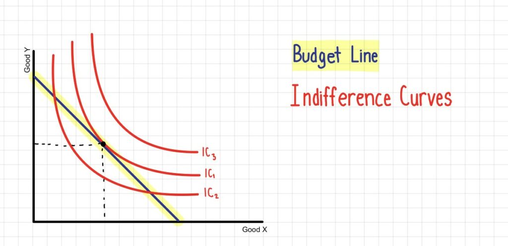
I created a screencast for this week’s lesson and found that the principles of multimedia learning had really improved the structure of learning the content. The screencast I made was of me showing how to read a specific graph for one of my economics classes. I used an app on my Ipad called Goodnotes that allowed me to write and highlight any important information that I wanted to discuss or point at. Reading and understanding certain graphs can be very challenging, so I wanted to use the signaling principle to make the lesson more comprehensible to a viewer. I would highlight any point on the graph that I was referring to and highlight the correlating header on the screen to address the visual and verbal information. I found that this principle was very helpful in distinguishing what is being discussed as it attracts the reader to only focus on one point at a time and not be confused with the other elements on the screen.

Here is an image from my screencast video!

To avoid extraneous load I wanted to also apply the redundancy principle to simplify what is being learned and not distract the viewer from being overwhelmed by the information being presented. In doing so, I avoided adding any extra written information, aside from the headers, as I would be narrating the screencast as well. I believe that the redundancy principle was very beneficial in simplifying the lesson being taught and making the presentation more visually appealing to a learner. As for the signalling principle, I think that this helps to break down the information into smaller sections that allow the learner to focus on one point at a time and follow a more structured path of understanding the given content. Overall I think that incorporating these principles truly improved how a viewer would gather and retain the information being shown.

Week 1 blog post

What made you decide to take this course? What are your learning goals this term?

I decided to take this course because I have previously taken other EDCI courses and have really enjoyed the content. I enjoyed these courses because I found the subject matter to be very relevant to how the world is advancing with technology. While I may not be in an educational program, as I am an economics major, the EDCI courses have taught me much about digital media and online learning. For this course specifically, I am interested in the design aspects of creating an effective learning platform that can incorporate interactive multimedia technologies for learning. I think that it is essential to learn the skills to be able to effectively teach and learn as we continue to move more towards online structures for learning not only in educational environments but in everyday life. I believe that being able to engage in whatever it is that is taught can enhance learning and improve the way instruction is designed, which is why I am interested in discovering more about interactive and multimedia as a tool for learning. 

Some of the personal learning goals I have set for myself in this course include, being open to new technologies. I have previously used WordPress in my EDCI 338 class, but I still feel that there is room for improvement in my technical skills and I need to practice using it as I have found myself getting confused and frustrated with some of the elements of the site. I however have not used Mattermost, which is something that I would like to get more comfortable with. Another one of my learning goals this term would be to strengthen my collaborative skills with my other classmates and learning pod. I want to improve how I work with others and focus on building projects more collaboratively, as in previous terms when there was group work, we would normally just assign a certain part of a project to everyone and that be it, rather than working more collaboratively and having everyone pitch in their thoughts and contribute more to the overall success of the team.

Powered by WordPress & Theme by Anders Norén