What do you think the presentations in The World’s Worst Powerpoint Presentations have in common? Which design principles and which other principles (Mayer’s, Inclusive Design, UDL) are they missing?
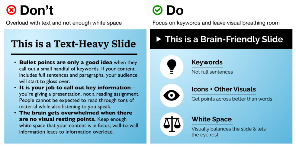
The presentations in The World’s Worst Powerpoint Presentations were all very similar in that they do not follow the principles of Mayer’s Cognitive Load Theory. When I first looked at the Powerpoint slides that were shown in the article, my first thought was how the extraneous load was being maximized. At first glance, these presentations were very hard to read as they all seemed to have way too much on the slides and could not draw my eye to any certain point. Negative space is so important for keeping presentation slides coherent because it helps reduce the extraneous load, which aids the audience in not becoming overwhelmed.

One of the slides that were shown in the article had a very confusing diagram that lacked any visual coherence. This was partly due to the amount of text that was on the slide, however, the most significant contender to why this particular slide failed was the amount of colour and how it was used. The slide used about 10 colours, which paid no benefit in assisting the viewer to understand the given information and created no balance on the slide. Optimizing colour to support your design and the idea that you want to present can be very important and will help guide audiences to understand and break down ideas. This design principle helps to manage the intrinsic load in presentations, as it could help to segment ideas together.

I thought that this week’s topic was really interesting and fun. The design principle that I thought was one of the most important to note was the negative space principle. I think that using negative space in any design can prove to be very effective in ‘calming’ the eye and drawing it to focus on only one or more points, which results in reducing the extraneous load and managing the intrinsic load.
