Month: October 2022

Week 6 Blog Post

Where do you see constructive alignment and backward design used in this course or another course you are taking/have taken?

Incorporating instructional design into course planning is key to keeping students engaged and on the right track. Setting learning outcomes early in the course can guide students to be prepared for what they will learn and give them insight into what is expected of them.

In most of my courses, the professors are generally very good at identifying the learning outcomes for the course or lesson early on, which helps me get an understanding of what is to come and how I approach the course or lesson at hand. I will often see this in the syllabus of the course or more commonly, in each lecture where the ‘learning goals’ are outlined for a specific lesson.

This week’s lesson reminded me of an assignment I did in my EDCi 339 class over the summer. I got to design and create a mini-course about any topic, where I would be designing the course layout and making my own lecture videos. One of the most essential parts of creating this mini-course was setting the learning outcomes early on to guide how we design the course and what we want to incorporate so that these learning outcomes are met. Here is a photo of the learning outcomes I made for my skincare 101 course:
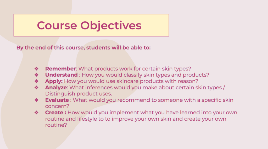
Skincare 101 mini-course “Course Objectives”

Having these course objectives pre-established made creating the mini-course much easier for me, as I was able to use them as a guide to narrow down what information I needed to include and how I was going to assess the ‘students’. This mini-course assignment overall was really fun and definitely gave me insight into how instructors design courses.

Now having learned about Constructive Alignment and Backward Design, it was really interesting to look back at my mini-course and see how I incorporated them into it without knowing about these design principles. Instructional design is key to creating a strong framework for a course or lesson that benefits both students and instructors.
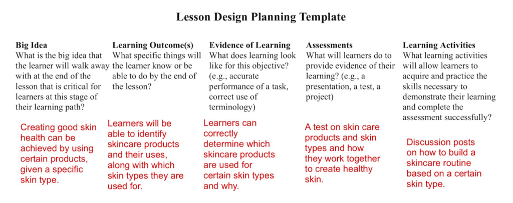
Here is the lesson plan I made that is based on my skincare course

Also, if you are interested, here is a link to my mini-course that I created with google slides:

Mini-Course: Skincare 101

Week 5 Blog Post

What do you think the presentations in The World’s Worst Powerpoint Presentations have in common? Which design principles and which other principles (Mayer’s, Inclusive Design, UDL) are they missing?

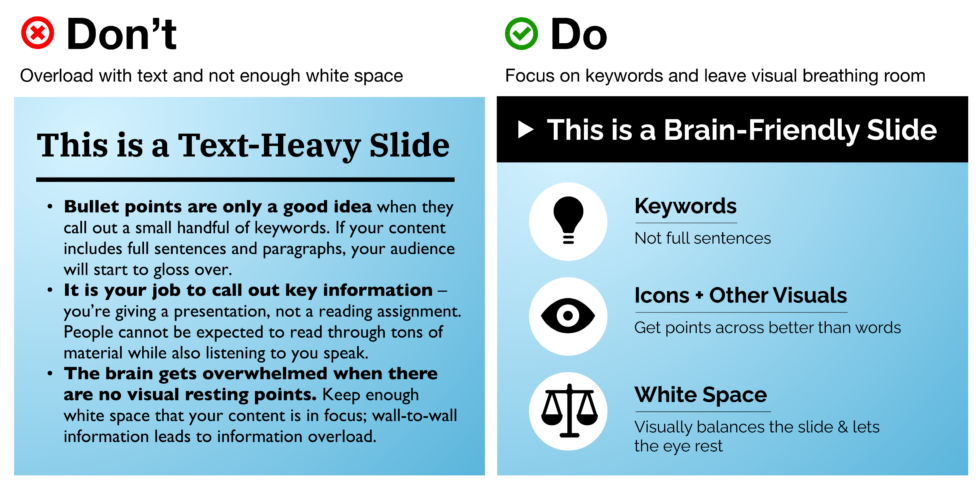
The presentations in The World’s Worst Powerpoint Presentations were all very similar in that they do not follow the principles of Mayer’s Cognitive Load Theory. When I first looked at the Powerpoint slides that were shown in the article, my first thought was how the extraneous load was being maximized. At first glance, these presentations were very hard to read as they all seemed to have way too much on the slides and could not draw my eye to any certain point. Negative space is so important for keeping presentation slides coherent because it helps reduce the extraneous load, which aids the audience in not becoming overwhelmed.

Comparing a slide with no negative space and one with negative space. The slide with negative space is much easier to look at and comprehend the text.

One of the slides that were shown in the article had a very confusing diagram that lacked any visual coherence. This was partly due to the amount of text that was on the slide, however, the most significant contender to why this particular slide failed was the amount of colour and how it was used. The slide used about 10 colours, which paid no benefit in assisting the viewer to understand the given information and created no balance on the slide. Optimizing colour to support your design and the idea that you want to present can be very important and will help guide audiences to understand and break down ideas. This design principle helps to manage the intrinsic load in presentations, as it could help to segment ideas together.

Here is the slide I am referring to in The World’s Worst Powerpoint Presentations

I thought that this week’s topic was really interesting and fun. The design principle that I thought was one of the most important to note was the negative space principle. I think that using negative space in any design can prove to be very effective in ‘calming’ the eye and drawing it to focus on only one or more points, which results in reducing the extraneous load and managing the intrinsic load.

Week 4 Blogpost

Have you used Text to Speech tools before? Did you find it useful? Did you try out some of the different voices? What impact did the different voices have on your ability to absorb information?

I tested out a few of the Text to Speech web extension tools listed including, Read Aloud and Natural Reader. I found them both to be useful, however, I preferred Natural Reader much more because I found it easier to navigate and personalize to my audio preferences, such as the voice and speed. I noticed major differences between the voice on Read Aloud and the voice I selected on Natural Reader. The voice I selected was “Sara”, which was a woman’s voice that seemed to be the most natural human voice and it did not sound very robotic compared to the other options. I also really liked that I could set my own speed for the reading, as it could flow at the same pace that I would normally read. I had actually found that this tool was quite helpful when I was testing it on the EDCI 337 website. I really liked how it would highlight the section it was reading off in small chunks as it made me pay more attention and kept me engaged. One thing that I did notice that may not be very helpful to someone who is visually impaired, is that it did not state aloud if there was a photo, but would just read the text below it. If the text below the image did not have any mention of there being a photo, such as, “This is an image of”, it would likely cause some confusion to someone with visual impairment. I thought this was interesting because in Katie Sehl’s article, Inclusive Design for Social Media: Tips for Creating Accessible Channels, it was mentioned to skip saying “image of”, as those who are visually impaired prefer to not have that. This made me more curious about the multimedia preferences of visually impaired people and I am keen to learn more about it.

This image demonstrates the difference between equality and equity. On the left side, there are three people trying to pick apples off a tree but they are all different heights and only 1 person can reach the apples, which illustrates equality. On the right side, showing equity, there are the same three people, but those who were not able to reach the tree now have something to step on to make them able to grab the apples.

I thought this week’s content was really interesting and gave me further insight into how to properly accommodate the learning needs of many people. Having a multimedia framework that can serve the same functionality to everyone is so important and can greatly help those who may have disabilities or need extra support for their learning and other uses for media. 

Powered by WordPress & Theme by Anders Norén